
One of the latest trends in menus is to place a rotating slideshow in the header of your home page with links to important sections of your website. Think of it as like placing very large feature boxes in the header that rotate one at a time. This addes a sense of dynamic motion to your website that really attracts the attention of your views and gives you a much larger canvas to paint on. We will begin by dicussing how to put a single large image into your header with a similar Title, Description and READ MORE button as we used for our Feature Box Menu Items. We will then show how to rotate the header between two or more images.
Create a New Root Folder
Copy the root folder from our previous section and then rename it My Header Slideshow Website. View the index.html file in your browser to make sure it appears properly.

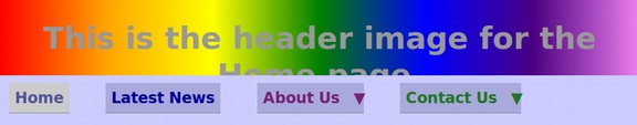
Currently, our header has a background linear gradient color and a foreground sentence. While we could have placed the text in an image, text will always be more crisp and easy to read if it is in the HTML rather than the CSS. There is a major problem with placing text in the foreground of our header. Make the browser narrower and you will see that the header text is not responsive. It remains the same size as the browser window narrows and therefore partially disappears below the main menu:
In the next chapter, we will explain how to use Viewport Units to make this text responsive and shrink in size as the browser window. But in this chapter, we will simply add the text to our images as we make the images and then place the images in the foreground. Then as the image shrinks along with the browser window, the text will automaticall shrink with it.
The text inside the foreground image will not be as sharp as foreground text in front of a background image. But this method is much easier than the methods we will describe in Chapter 6.
Here is the current HTML:
<header><h1>This is the header image for the Home page.</h1> </header>
Note that the header section is affected by the header element selector and the h1 element selector.
Here is the current CSS:
header {height: 80px; text-align: center; color: #999999; background: linear-gradient(to right, red, orange, yellow, green, blue, indigo, violet);}
The h1 selector is not present in our current CSS. Therefore the web browser uses its own default settings for the h1 element except for those properties specifically defined in our custom header CSS settings. So the font size is still controlled by the browser because we have not provided any other settings for it. The first thing we will do is increase the height of the header section from 80px to 300px. This will give us a larger canvas to work with.

Next, we need to plan our header slideshow.
Plan Your Header Slideshow
The current header consists of a background gradient image and a foreground title. The header title, slogan and image will be at the top of every page of your website and will shape the viewer’s impression of your site. You want to take some time to create and install a good image which reflects the goal of your website. Remember that a picture is worth a thousand words – and images are everything!
On your Home Page (but not your other pages) we will add three more header slides that rotate with our normal header so that each of these four slides appears for 5 seconds. It will therefore take the viewer about 20 seconds to see the entire header slideshow.
9 Steps to Create your own Header
There are basically 9 steps in creating and installing your own custom header:
#1. Design your custom header
#2 Find and/or create your own header images
#3 Add text and Fake READ MORE button to the image.
#4 Optimize the file size of your image for the web
#5 Modify the height and width of your image
#6 Place a link to your header image in your header container
#7 Make your Header Image linkable
#8 Create and add your second through final images.
#9 Create a CSS autoplay transition to rotate between the images.
Let’s review these 9 steps to see how you can create and install your own header images and text. We will assume that you have been given the job of designing a rotating slideshow for a new business called Pet Education Center. Their slogan is “Where pets go to train their owners!”. They sell and train four kinds of pets: cats, dogs, birds and hampsters. They have given you an image of each kind of pet and left the rest up to you.
Step One: Design your custom header
Your custom header image will consist of two parts, a background image and foreground text For this exercise, we will create a full width background image that is 2000 pixels wide and about 600 pixels high. The reason we will use 2000 pixels for our image width is that the maximum screen width on most laptops is 1920 pixels. Having our image wider than 1920 pixels will insure that our slideshow takes up the full width of the viewers screen.
As for the height of the background image, we will use the assumption that our viewer is using a laptop with a high resolution 1920 pixel by 1080 pixel screen. Let assume that the viewer has taken my advice and is using two side by side open windows. One has a document they are working on and the other window has the website you have created. This means that their browser screen width is about 1000 pixels wide (or about half of 1920 pixels). The height of their screen will be just under 1080 pixels.
We want the viewer to see our header image, our main horizontal menu, our feature box menu and the top of the main content of our Home page. Subtracting 100 pixels for the top of the browser window, 300 for the Feature Box Row, 200 for the top of your main content area and 100 for the main menu and everything else, this leaves about 300 pixels for our slideshow height – if the width is 1000 pixels. Since our actual image will be 2000 pixels, the height for the actual image will be 600 pixels.
Allow space in the image for readable text
There are several ways to combine slogans and images. One is placing the slogan over the top of the image. This requires an image with a space where a slogan can be read.

The second option is placing the slogan to the right of the image:

A third option is to place the slogan above the logo image:
Step Two: Find or Create Your Own Header Background Images
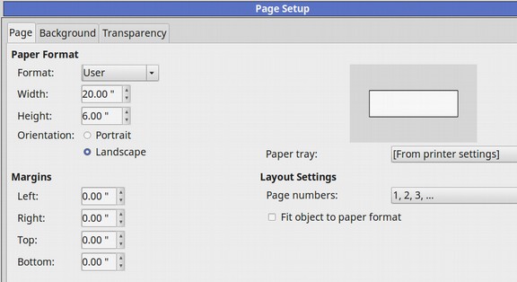
To keep this example simple, we will use a background image that has the text on the left and some pet images on the right. To set up a canvas to work on, open a new Libre Draw document and call it Pet Header Slideshow. Click on Format, Page and change the Page Layout to 20 inches by 6 inches.
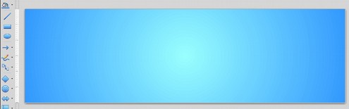
Set the margins for 0 inches. Then click on the Background tab and click on the Gradient option. Then give the first image a green radial gradient background. Then click OK. Here is what our slideshow canvas now looks like:
Get or create a transparent PNG of several pets to place on the left side of this screen:
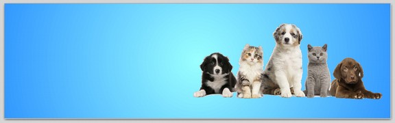
I created the above transparent PNG with a free open source graphics editor called Pinta. Save the above image in your images folder as header1.jpg.
Step Three: Add text and a fake READ MORE button to your image
Responsive websites automatically reduce the size of the header background image to match the screen size of the device being used to view your website. But, as we saw at the beginning of this section, they typically do not reduce the text if the text is in the foreground and the image is in the background.
There are two ways to make the text responsive and reduce in size as the screen width and image are reduced in size. Here we will review the simple way – which is to include the text inside of the responsive background image – and leave the foreground empty.
The second way is to place the text in the HTML section of your web document (which will place the text in the foreground of your header container) and then use a CCS 3 property called Viewport units to have the font size scale with the image and container size. We will review this more complex second option in the next chapter.
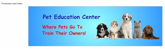
The simple way is to add text boxes and a fake READ MORE button to your Libre Draw canvas. Then make the canvas as wide as possible and capture the screen show with a free Linux screen capture tool called Shutter. Open a new Writer document, Name it Pet Education Center Header. Click on Format Page and set it for landscape with a width of 20 inches. Then paste the shutter image into the Writer document.
Here is what this image looks like in the Writer document:
Step Four: Optimize your header image file size for the web
The next step is to reduce the file size (optimize the image) so that the header will load more quickly on the web. The general rule is that web image sizes should be under 100 KB. But since this is the header, this image can be a little bigger if needed. Using Libre Writer, you can quickly optimize all of your images by right clicking on them and then selecting Compress Graphic.
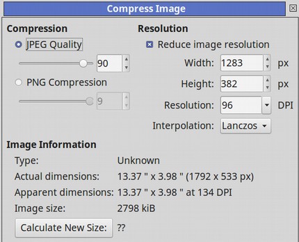
This image is currently 2798 kB. This would greatly slow down the loading time of all of your web pages. Click OK to reduce the file size. Then right click again on the image and select Compress. The file size has been reduced to 79 kB even though the image size has remained at 1283 by 382 pixels.
Step Five: Modify the height and width of your Image
You can use any of several free image editor tools to stretch or crop an image. A good cropping tool for Linux is Fotoxx. Linux Mint comes with a free image editing tool called Pix. Nearly every Image Editor has a Resize option which can be used to stretch an image. First after compressing the image, save the image as header2.jpg to your website images folder. Increase the quality to 95%. Then select and open the image with Pix. Click Resize and blow it up to 2000 pixels by 600 pixels.
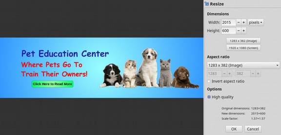
Note that to get 600 pixels high, the width increased to 2015 pixels. Click OK. Then click Crop. Click Maximize. Reduce the width by 15 pixels. Then click Crop. Then save the image to your website images folder as header2_2000.jpg.
#6 Place a link to your header image in your header container
Open your website index.html file with your bluefish editor. Scroll down to your header container. It currently reads:
<header><h1>This is the header image for the Home page.</h1> </header>
Replace the above with this:
<header><img src="/images/header2_2000.jpg" alt=”pets header”></header>
Then save the file and view the page with your browser. The header image is way too big. Go up to your header CSS selector. It currently is this:
header {height: 280px; text-align: center; color: #999999; background: linear-gradient(to right, red, orange, yellow, green, blue, indigo, violet);}
Replace the above with this:
header {display: block; margin: 0 auto; max-width: 100%; height: auto;}
The header is still too big. Add a fixed maximum width to the element the header is contained in which in this case is the wrapper. Here is the CSS for the wrapper.
.wrapper { background-color: #dddddd; margin:auto; }
Replace it with this:
.wrapper { background-color: #dddddd; margin: 0 auto; max-width: 960px; }
Also in the HTML, replace
<header><img src="/images/header2_2000.jpg" alt=”pets header”></header>
with this:
<header><img style="display: block; margin: 0 auto; max-width: 100%; height: auto;" src="/images/header2_2000.jpg" alt=”pets header”></header>
Note that in this case, the styling has to be right inside of the header image tag rather than just inside of the header tag for this image to be responsive. Then click Save and view your website.

Note that as you make the viewing window narrower, the image adjusts to fit the width of the window. Also the text gets smaller along with the image. But if you click on the READ MORE button or the image, nothing happens. You are not taken to the promised page. We will next make the entire image a link so that our fake READ MORE button will appear to work.
#7 Make your Header Image Linkable
Recall from our previous chapters that to make an image linkable, we surround the HTML with an anchor tag.
<a href=”/index.html”><img src=”images/myheader.jpg alt=”alt text”/></a>.
Adding these anchor tags around our image tag makes our Header HTML:
<header><a href="/index.html"><img style="display: block; margin: 0 auto; max-width: 100%; height: auto;" src="/images/header2_2000.jpg" alt=”pets header”></a></header>
Save the file and view with your browser. The header image will appear the same. But click on the READ MORE link or anywhere in the header image and the page will reload. Now that we have the main header that will appear on every page of our website, let’s create the second image which will only appear in the Home page slideshow.
#8 Create Your Second Slide
Go back to your Libre Writer Draw Slideshow template and click Insert, New Page. Click Format Page to change the page background color to radial green. Insert a copy of our cat picture on the right side of the canvas. Then insert a text box on the left side with Learn All About Cats… This cat needs a home! Also add a fake READ MORE button. Here is our second image:
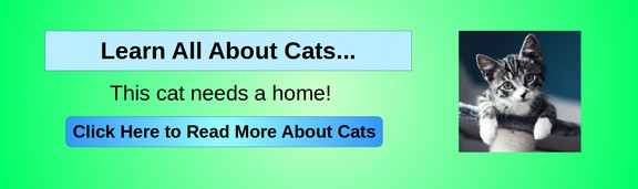
Save this image to our Writer Pet Education Header document. Then right click on it and click Compress. Then save the image in our images folder as header3.jpg. Then open the image with Pix and resize it to 2000 pixels. Crop it and save it as header3_2000.jpg. Then in our HTML, change the background image url from 2 to 3. Also change the target URL from index.html to cats.html. Then save the file and view in your browser:
Test that the clicking on READ MORE takes you to the cats page. Now that we have a couple of images, let’s set up a transition between the two images.
#9 Create a CSS autoplay transition between your header slide images
There are several ways to add transitions between images with Javascript. But Javascript is often disabled by viewers for security reasons and also slows down loading your pages. We will therefore use a CSS transition method. Here is the code for our four images:
<header>
<a href="/cats.html"><img style="display: block; margin: 0 auto; max-width: 100%; height: auto;" src="/images/header2_2000.jpg" alt=”pets header”></a>
<a href="/cats.html"><img style="display: block; margin: 0 auto; max-width: 100%; height: auto;" src="/images/header3_2000.jpg" alt=”cats header”></a>
<a href="/dogs.html"><img style="display: block; margin: 0 auto; max-width: 100%; height: auto;" src="/images/header4_2000.jpg" alt=”dogs header”></a>
<a href="/birds.html"><img style="display: block; margin: 0 auto; max-width: 100%; height: auto;" src="/images/header5_2000.jpg" alt=”birds header”></a>
</header>
Save the file and view in the browser. At this point, you will see all four header images at the top of the page. What we need to do is hide the images and then display them one at a time. To do this, we will place divides around each of the images. We will then place another divide around all four images with <div id="slider">
Here is the resulting HTML for the header section:
<header><div id="slider">
<div><a href="/cats.html"><img style="display: block; margin: 0 auto; max-width: 100%; height: auto;" src="/images/header2_2000.jpg" alt=”pets header”></a></div>
<div><a href="/cats.html"><img style="display: block; margin: 0 auto; max-width: 100%; height: auto;" src="/images/header3_2000.jpg" alt=”cats header”></a></div>
<div><a href="/dogs.html"><img style="display: block; margin: 0 auto; max-width: 100%; height: auto;" src="/images/header4_2000.jpg" alt=”dogs header”></a></div>
<div><a href="/birds.html"><img style="display: block; margin: 0 auto; max-width: 100%; height: auto;" src="/images/header5_2000.jpg" alt=”birds header”></a></div></div></header>
We will then place keyframes in our CSS section to trigger switching between images. We will also make the divides responsive using percents to adjust for screen widths. Here is what we will add to the bottom of the CSS section:
div#slider {overflow: hidden; margin: auto; width: 100%; max-width: 1000px; max-height: 300px;}
div#slider div {position: relative; width: 500%; margin: 0; left: 0; font-size: 0; animation: 20s slider infinite;}
div#slider div img {width: 20%; float: left;}
@keyframes slider {
0% {left: 0%;}
20% {left: 0%;}
25% {left: -100%;}
45% {left: -100%;}
50% {left: -200%;}
70% {left: -200%;}
75% {left: -300%;}
95% {left: -300%;}}
Save the file and view in the browser. Change the screen width to verify the images are responsive. Click on the header images to see that they link to the various pages. The only problem with this slideshow is that the header breaks into a huge image when on narrow screens. This is because the initial max-screen width for the main element was set for 1000px. Make it 600px. Then make it 1000px for the media query min-width 640px. Also place this CSS above the media query:
div#slider {overflow: hidden; margin: auto; width: 100%; max-width: 600px; max-height: 200px;}
div#slider div {position: relative; width: 500%; margin: 0; left: 0; font-size: 0; animation: 20s slider infinite;}
div#slider div img {width: 20%; float: left;}
@keyframes slider {
0% {left: 0%;}
20% {left: 0%;}
25% {left: -100%;}
45% {left: -100%;}
50% {left: -200%;}
70% {left: -200%;}
75% {left: -300%;}
95% {left: -300%;}}
Save the file and check its appearance on a narrow screen with your browser. If all went well, the images should now be correctly sized for all screen widths.
What’s Next?
This completes Chapter 5 and our overview of website menu options. In the next chapter, we will take a closer look at web graphics.