
At the end of the last section, we placed simple feature boxes inside of a hidden mega menu that drops down from a top level main menu item when the viewer hovers their cursor over that menu item. In this section, we will learn how to make more complex feature boxes and place them in rows that are always visible. The reason to use Feature Boxes instead of hidden drop down mega menus is that you do not run the risk of the your readers failing to hover over the parent menu items and thus not even seeing your beautiful mega menu feature boxes. Placing Feature Box Menus in rows where they are visible all the time also allows for more styling options than are available inside of a mega menu dropdown. Here is an example of four feature all placed in a single row.
These are feature boxes made inside of the Joomla Content Management System using Module Classes applied to Joomla Custom HTML modules. A module is a the term used by Joomla to refer to a box or block of content.
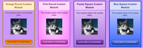
Examples of Simple Feature Boxes
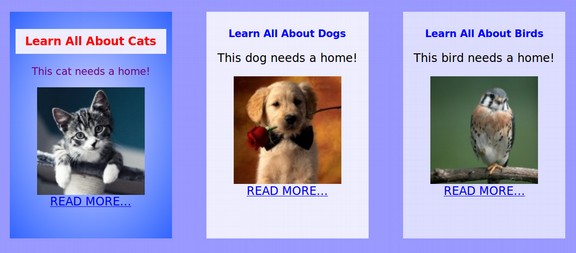
We have already made simple feature boxes visible in rows at the end of our chapter on page layouts. Here is what these feature boxes look like.
So far, these boxes simply have a background color and a one sentence description. We will review how to style these boxes into more inviting links.
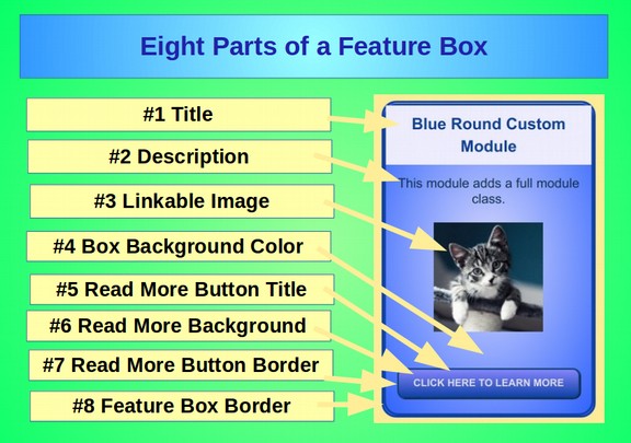
Eight Parts of a Feature Box
A Feature Box has eight parts each of which can be styled independently.
Use the Bluefish Editor to Style Feature Boxes
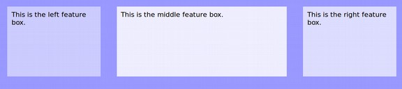
Create a new root folder called My Featue Box Website. Then copy the files and folders from our previous website example into this folder. Then open the index.html page with Bluefish and display it with your web browser to make sure the appearance is still correct. In this section, we will work on the row in our HTML file with a name or class called Container 1. Here is the current HTML for this row:
<div class="container1">
<div class="left">This is the left feature box. </div>
<div class="middle">This is the middle feature box. </div>
<div class="right">This is the right feature box. </div>
<span></span></div>
This row has three divides or feature boxes with classes called left, middle and right.
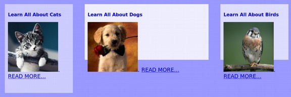
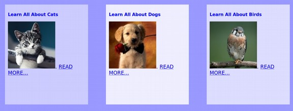
Scroll up the file to the Mega Menu Feature Boxes area we worked on at the end of our last section. Here is the HTML for these Feature Boxes:
<div class="column1"><h3>Learn All About Cats</h3>
<a href="/cats.html"><img src="/images/cat.jpg" alt="cat"></a>.
<a href="/cats.html">READ MORE...</a></div>
<div class="column2"><h3>Learn All About Dogs</h3>
<a href="/dogs.html"><img src="/images/dog.jpg" alt="dog"></a>.
<a href="/dogs.html">READ MORE...</a></div>
<div class="column3"><h3>Learn All About Birds</h3>
<a href="/birds.html"><img src="/images/bird.jpg" alt="bird"></a>.
<a href="/birds.html">READ MORE...</a></div>
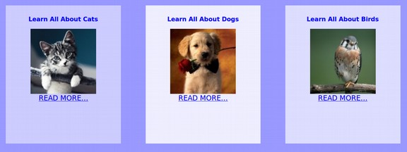
Copy this HTML into your clip board. Then paste it in place of the left middle and right feature boxes. Then chance the class names from columns 1, 2 and 3 to left, middle and right. In your CSS, increase the height of the container one divide from 150px to 250px. Then save the file and view with your browser:
Our Feature Boxes are a little messed up. We first need to make them all the same width. We will use percentages so the boxes will be responsive and get wider as the readers screen gets wider. We will also use three percentages that total to much less than 100% so that the third Feature Box is not pushed below the other two feature boxes by hidden margins and padding. The current widths are 21, 40 and 21 percent. Make them 26, 26 and 26 percent.
Here is what our equal width Feature Boxes now look like:

Here is our current CSS:
.left { margin: 2%; padding: 1%; width: 26%; height:250px; text-align:left; background-color: #ccccff; }
.middle { margin: 2% 0; padding: 1%; width: 26%; height:150px; text-align:left; background-color: #eeeeff;}
.right { margin: 2%; padding: 1%; width: 26%; height:150px; text-align: left; background-color:#ddddff; }
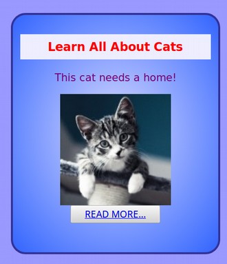
Note that the middle class has a margin of 2% on the top and bottom, but 0% on the left and right. Delete the zero so the margin is 2% all around for all three boxes. Also note that the heights of the second two boxes are only 150px. Make all three of them 300px as we will need more room below the title to put in our descriptions. Here are our Feature Boxes now:
We next need to center the titles, images and READ MORE links.
We can do this in our CSS by changing all three classes from text-align: left; to text-align: center;. Next, in your HTML, add a class to each image called center. Here is the center class added to the cat image:
<img class="center" src="/images/cat.jpg" alt="cat">
Then add a CSS selector called .center {display:block; margin-left: auto; margin-right: auto;} The save the file and view the page with your browser.
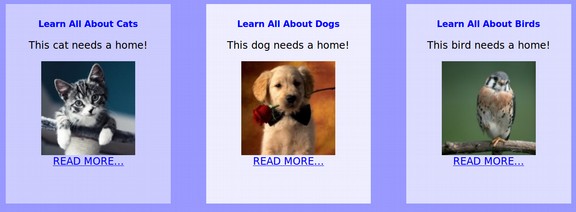
Add Descriptions to your Feature Boxes
Descrptions have to be very short and use smaller than normal text. We will add the following:
<p class=”smallfont”> This cat needs a home!</p>
Then add this class to our CSS: .smallfont {font-size: 10px; color: #000000;}
Then save the file and view with your browser.
We will next add custom styles for our Title and Description.
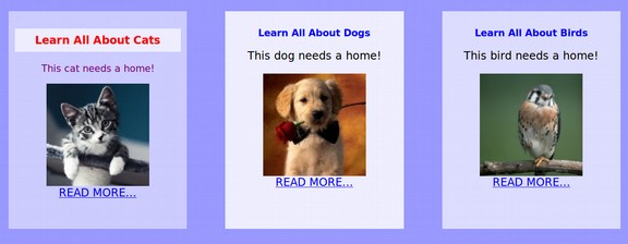
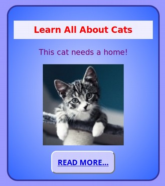
How to Add Different Styles for Feature Box Title and Description
The background colors for the entire above row is controlled by a class called container1. Then the background colors for each of the three boxes are controlled by classes called left, middle and right. We could create new classes called custom_title and custom paragraph to give different backgrounds to the title and descriptions of the three boxes. But then the titles and descriptions would all have the same styling. If we want to have a different background color for each feature box and a different style for each title and description in each box, we can use a combination selector such as .left h3
This combination selector tells the browser that when there is an h3 tag that is in a class called left, apply these styling properties. We will add combination selectors for titles with .left h3 and for descriptions with .left p. Here is the current CSS for our left class:
.left { margin: 2%; padding: 1%; width: 26%; height:300px; text-align:center; background-color: #ccccff; }
The middle and right classes have the same CCS except for different background colors. Add the following combination class to control the appearance of the left title and description:
.left h3 {text-align: center; font-size: 16px; color: #ff0000; font-weight: bold; padding: 6px; line-height: 1.4; background-color: #eeeeff;}
.left p {text-align: center; color: #770077; font-size: 14px; font-weight: normal;}
Then save the file and view with your browser:
Slowly but surely, we are gaining control over every aspect of our Feature boxes.
Create Gradient Backgrounds for your Feature Boxes
Until now, we have only used solid color backgrounds. Next we’ll create a gradient background style. A gradient is just a transition between two colors in the background. We will start with a medium blue at the bottom leading to a lighter blue at the top. But you can change these to any two colors you would like. It is best to use an online gradient generator to help you determine the right CSS for the background gradient you would like. Here is a link to one of the easiest gradient generators: http://www.cssportal.com/css-gradient-generator/
Go to this web page. Then Click on either the Linear or the Radial Style. After selecting Radial, select Middle Center to Farthest Corner (which is the default). Then enter the two colors you want. We used Radial with #DDDDFF (very light blue) to Start and #3366FF to End (medium blue). Here is what the online color generator page looks like:
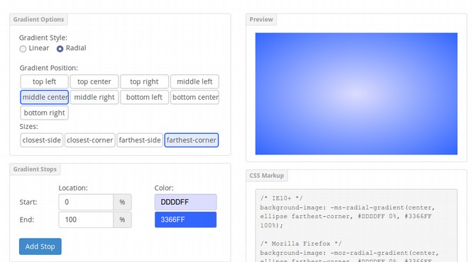
Then copy the CSS Markup needed for various web browsers into your class CSS. Here is the long version of the CSS:
/* IE10+ */
background-image: -ms-radial-gradient(center, ellipse farthest-corner, #DDDDFF 0%, #3366FF 100%);
/* Mozilla Firefox */
background-image: -moz-radial-gradient(center, ellipse farthest-corner, #DDDDFF 0%, #3366FF 100%);
/* Opera */
background-image: -o-radial-gradient(center, ellipse farthest-corner, #DDDDFF 0%, #3366FF 100%);
/* Webkit (Safari/Chrome 10) */
background-image: -webkit-gradient(radial, center center, 0, center center, 242, color-stop(0, #DDDDFF), color-stop(100, #3366FF));
/* Webkit (Chrome 11+) */
background-image: -webkit-radial-gradient(center, ellipse farthest-corner, #DDDDFF 0%, #3366FF 100%);
/* W3C Markup */
background-image: radial-gradient(ellipse farthest-corner at center, #DDDDFF 0%, #3366FF 100%);}
In fact, we do not need hardly any of the above CCS as it is intended for older browsers – which folks really should not use anyway. All we need is this small portion of the W3C Markup added to our left class css in place of background color:
background: radial-gradient (#DDDDFF, #3366FF);
We could also use
background-image: radial-gradient (#DDDDFF, #3366FF);
But we should not use background-color as a gradient is not really a color. Also, it is essential that there be no space between the word gradient and the first parathesis. Then save the file and view with your browser.
You can also add more than one color to your linear or radial gradients. For fun, let’s add the following background to the CSS for our header (replacing the previous background color of #ccddcc):
background: linear-gradient(to right, red, orange, yellow, green, blue, indigo, violet);
Note that there should be no spaces between the color names). Also change the h eader element text-alignment to center and font color to #999999 so it is visible in front of all colors. Then save the file and view with your browser:
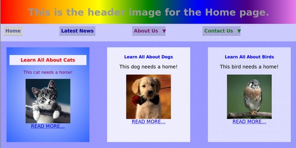
Adding colorful backgrounds is a good way to add interest to your site.
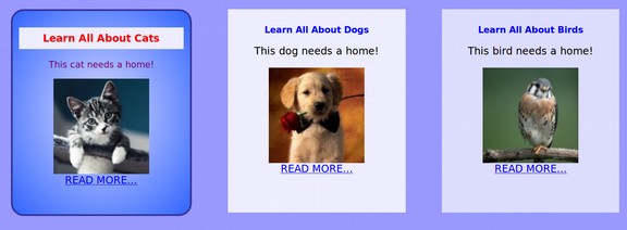
Add Borders to your Feature Boxes
Our custom feature boxes are gradually starting to look more professional! We will next place a custom border around our custom feature box We will add the following CSS to our .left class:
border-style: solid; border-width: 3px; border-color: #333399; border-radius: 20px;
Save the file and view it with your browser:
Once you have a file like this in your custom CSS file, it is very easy to change its value to whatever you want. Our main purpose is simply to create it so we have something to work with.
How to Add a Custom READ MORE button to our Feature Boxes
We will next review how to create CSS for special link tags. The technical name for the READ MORE link in our feature boxes is buttons. Whenever we want to turn an a anchor link into a button, we should put the button brackets around the a tags. So instead of the left feature box READ MORE link being:
<a href="/cats.html">READ MORE...</a>
it would be:
<button><a href="/cats.html">READ MORE...</a></button>
Click file save and view site:
Because we have not applied our own custom style to the button element, the web browser applies its default button style – which is simply a blue link in a square gray box. Pretty boring. Add the following to the bottom of our CSS:
button {background-color: #ccccff; border-radius: 10px; color: #ddddff; text-align: center; font-size: 14px; font-weight: bold; line-height: 1.3; padding: 10px; display: inline-block; vertical-align: middle;}
The border radius property is what creates the rounded border on our button. The easiest way to create your own buttons is to go online to a button CSS generator. Here is a link to a very easy one: http://www.cssportal.com/css3-button-generator/
Use Preset Styles
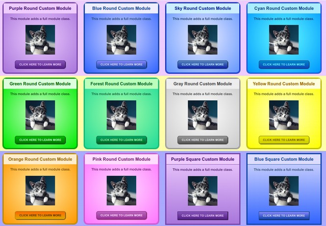
In our next book, Create Your Own Interactive Website, we review how to create and use preset styles for rapidly styling feature boxes. We present a series of 20 preset styles that can be copied into your CSS sheet as 12 classes. You then style your feature box just by adding the classes to the HTML element associated with your feature boxes. Here is what 12 of these 20 classes look like:
What’s Next?
This concludes our section on making custom feature boxes. In the next section, we will add a slideshow rotating menu to header section of our Home web page.