
Page Layout refers to how the articles and images are structured on your web page. Layouts typically refer to the number of rows and columns on the Home page – in particular to the number of columns in the main body of content on the Home page. The main body is the area where “Featured” articles are displayed.
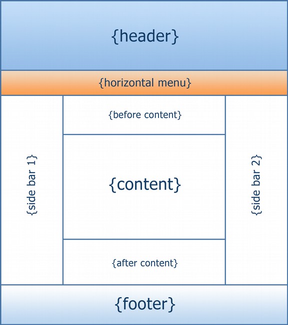
Example of a three-column layout:
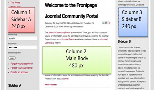
In the past, 3 column layouts – with side bar menus on both sides of the main content - were common. But three column layouts are very difficult to read. If the computer screen is 14 inches or 1400 pixels wide, and you are doing side by side editing, then each window is only 7 inches wide. After subtracting 1 inch for margins, each window is only 6 inches wide. Thus, each column in each window when viewing a 3 column layout is only 2 inches wide.
Benefit of a Single Column Layout
If you really want to convey information, you are better off with a one column layout with all the menu items at the top of the HOME page. This is how most books are written. At most, you should have two columns on your home page with a single side menu.
Example of a one column home page layout
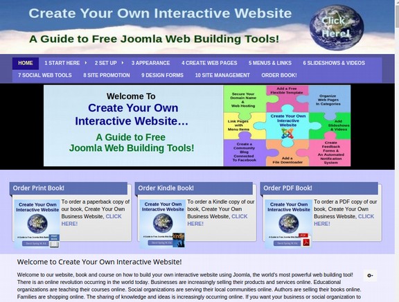
From the top down, it has a header, a main menu, a slide show and three modules in the Featured position above the main body. It is called a single column layout because there is only one column for the main body content. Note that just because you should use a single column layout for the main content area, this does not mean that all of the sections of your home page should be a single column. It is quite common to have “feature boxes” at the top and bottom of your HOME page to highlight particular sections of your website.
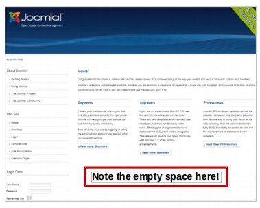
Two and Three Column Layouts have Empty Space
One of the problems with the layout of articles on three column layouts is that there is a bunch of empty space below the featured articles because the content in the three columns do not take up the same amount of vertical space. In addition to not looking very good, this is not a very effective way to communicate information.
Sidebar Menus instead of Horizontal Top Menus can also result in wasted space.
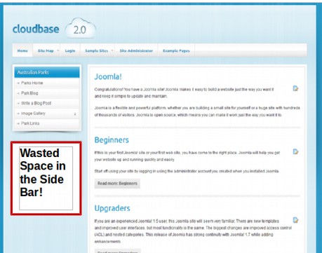
Sidebar Menus also make it more difficult to read content as the width of articles must be reduced to accommodate the side space.
Fixed Width Tables or Variable Width Divides for Page Layout?
In the next sections, we will first describe how to use tables to create page layouts and then how to use divides to create page layouts. Nearly all authors these days will tell you that a variable width page layout is better because nearly half of all web viewers are viewing web pages on their smart phone – which is at most 400 pixels wide. As a teacher whose primary lifelong goal has been to help my students learn in the most efficient and effective manner, I think we should reflect on the wisdom of encouraging the use of reading web pages on mobile phones.
To put it bluntly, trying to read and comprehend important articles on an extremely tiny screen is an extremely bad idea – just as trying to read an article on a screen that is 20 inches across is a very bad idea. There is a reason that the standard paper size is 8 ½ inches wide. It is because after subtracting 1.25 inch margins on both sides, the most efficient way to read a paragraph is when the paragraph is 6 inches wide.
A fixed width page layout with a main content area of 700 pixels allows for a 600 pixel wide screen after subtracting for the side margins and padding. As we explain in more detail in the next section, you can use a max-width setting on the page wrapper to insure that the page layout goes no wider than a pre-defined fixed width while at the same time automatically adjusting the content to move to adjust for smaller screens. So the debate does not have to come down to divides are good and tables are bad. My hope is that in the future, web authors will again start to see the benefits of a well defined fixed width layout – whether they achieve their layout with tables or with divides.
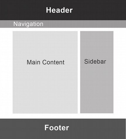
One Versus Two Versus Three Column Layouts
At the beginning of this chapter, we reviewed the benefits of a single column layout. These benefits include easier readability and less wasted space on the page. However, if you set the page layout for a 960 grid, there would be room for a 640 pixel main content area and a 320 wide pixel side column area.Therefore, one could have a two column layout and still have a readable main content area. Below are some examples of one column, two column and three column page layouts.
Simple Rows with only one column
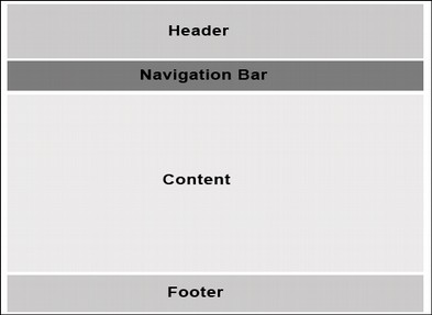
Simple Rows with two columns
Three Column Layout
What’s Next?
In the next section, we will look at how to set up a page layout – whether you are using tables or divides for the actual layout. We then explain how to use tables for layout. This exercise will lay the ground work for using divides for layout which we cover in the following section.