
In this section, we will introduce a very important and complex topic – namely options and methods for laying out the order of the various sections of your web pages. We will begin by going back in time to the days when all websites were laid out using tables with fixed widths. We do this not because we want you to use fixed width tables but rather because this is the easiest way to learn the basics of web page layouts. We will then describe how to use div tags to divide up your content into boxes and then use the float property to position your divides where you want them on your web page. We do this not because we expect you to use Divides and Floats to layout your real web pages – but rather because it is important to understand how responsive design is achieved on a modern web page. So think of this chapter as merely the first step in a long process.
In our next book, we will explain how to use a Joomla Framework called Sparky to layout the content for an interactive website. In the course after that, we will explain how to layout the boxes and categories for a news website. Then in a later course, we will explain how to layout content for an online store. But all of that is in the future. For now, let’s begin by building our first simple layout with a simple table.
Common tags used in an HTML Table Layout
The good news is that there are only a few tags used to create HTML Table Layout. The HTML, HEAD and BODY TAGS are used only once at or near the start of your HTML document. While we will use the DIVIDE tag several times with a responsive layout, with a table layout, we will use it only once – to insert or Wrapper Selector.
The remaining three structural tags, TABLE, TABLE ROW (TR) and TABLE DATA CELL (TD) are used repeatedly to create the structure of your web page.
Then in the cells is where we will use our content tags which include the Heading tags and the Paragraph tag.
Here is a table describing the purpose of each tag.
|
Tag |
Description |
|
<html> |
Begins an html document. |
|
<head> |
The head is right after the HTML tag and begins the head or invisible part of the document |
|
<body> |
The body tag is right after the head of the document and begins the part of the html document visible in the viewer’s browser screen |
|
<div> |
The divide tag is used to define the wrapper which is a type of container that holds all of the other elements in the page. The wrapper is different from the body in that the body is the full width of the viewer screen and the wrapper is narrower and often a fixed width centered in the viewer screen. |
|
Begins a table inside the body of a document OR inside of an existing table. |
|
|
Begins a table row inside of an existing table |
|
|
Begins a table cell inside of an existing table row |
|
|
<h1>, <h2> |
Heading tags used to style the headings of various sections of a document. |
|
<p> |
Paragraph tag used to contain and style the paragraphs of a document. Often paragraph tags come with a class=”” attribute to define the CSS in a style sheet or a style=”” attribute to define the CSS directly in the document HTML. |
HTML, HEAD AND BODY TAGS
HTML stands for Hyperlink, Text Markup Language. All HTML tags come in pairs. One tag opens the document and the other closes it.
<html></html>.
Nested inside of these HTML tags are head and body opening and closing tags:
<html><head></head><body></body></html>.
The head section contains only hidden information about the web page, such as the Title, Author and Description used for Search Engines. Nothing in the head section is actually displayed. CSS may be put in the head of the document in a <style> tag (called an internal style sheet) or CSS can be put in a <link> tag in the head of a document (called an external style sheet). Or CSS can be put in a style= attribute directly in the body of the document. .
Body, Wrapper, Container, Outer Table or Single Table to Hold our Web Page Together?
We generally do not want to begin the page layout or styling with the body tag for the simple reason that the body is intended to run the full width of the screen. At most, it will contain a background color or image placed behind the fixed or flexible content of the page. This is why nearly all web pages use a divide tag to define a wrapper which is a CSS class that is styled to hold the rest of the content and all remaining elements inside of it. While this style can be set with a fixed width, such as 900 pixels, it is now more common to set the wrapper width with the max-width property and a maximum width of 960 pixels.
How Wide Should our Page Content Be? Why is 960px so popular?
We will assume that our viewer is using a 15 inch laptop with a high resolution 1920 by 1080 pixel screen and that the viewer will want to do side by side editing. This means that the working area for each screen or each web page document should be 1920 divided by 2 which is 960 pixels. 960px is also popular because it can be divided by 2, 3, 4, 6 and 12. We will also assume that the screen is 960 pixels high just because that will make the math easier for determining the height and width of various cells in our layout.
Should the Wrapper be Defined with a Class or ID?
It is common for the wrapper to be defined in an index.html document as an ID. Here is the HTML if the wrapper is defined as an ID:
<html>
<head></head>
<body>
<div id="wrapper">
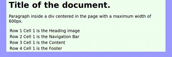
<h1>Title of the document. </h1>
<p>Paragraph inside a div centered in the page with a maximum width of 600px.</p>
</div>
</body>
</html>
Here is the CSS if the wrapper is defined as an ID:
body {background-color:#9999ff;}
#wrapper {
background-color: #eeffee;
max-width: 600px;
margin: 0 auto;
padding-right: 10px;
padding-left: 10px;}
There is a problem with using an ID for your wrapper. Remember that there is only supposed to be one ID per web page. If you use it for the wrapper, it will not be available for anything else. It is therefore wiser to use a class to define your wrapper. Here is the HTML if the wrapper is defined as a class:
<html>
<head></head>
<body>
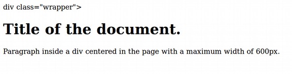
<div class="wrapper">
<h1>Title of the document. </h1>
<p>Paragraph inside a div centered in the page with a maximum width of 600px.</p>
</div>
</body></html>
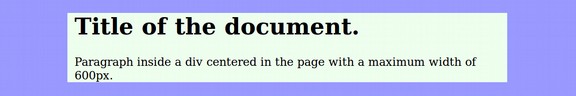
Here is the CSS if the wrapper is defined as a class:
body {background-color:#9999ff;}
.wrapper {
background-color: #eeffee;
max-width: 600px;
margin: 0 auto;
padding-right: 10px;
padding-left: 10px;}
Note 1: While most modern websites use a divide to set the wrapper inside of the body of the document, using divides is less wise when making an HTML newsletter as many email readers are so primitive that they do not recognize the div tag. Therefore with email newsletters, one often sees a table placed inside of a table. The outer table acts like a wrapper as a container to hold the inner tables together – especially in cases where there is more than one inner table. For now, we will use the div tag as a wrapper.
Note 2: Some complex page layouts have two or more large sections within the wrappers each of which requires its own CSS. It is common to create “container” classes within the wrapper when this is the case. Both the wrapper and the containers have their own div tags.
Note 3: Max-width has a benefit over width. If you do not set any width for your wrapper, it will extend over the entire width of the readers screen – just like the body. This is why the width is often set in the wrapper. However, using a fixed width is a problem if the browser window is narrower than the fixed width of the wrapper as the mis-match will trigger a horizontal scroll bar. Folks are used to vertical scroll bars but horizontal scroll bars should be avoided. Using max-width solves this problem because it automatically adjusts for narrow screens like smart phones.
Now that we have a better understanding of the need for a wrapper, let’s create a new website root folder called My Page Layouts. Inside this folder, put an images folder and a css folder. Then start Bluefish and create a new HTML document. Copy and paste the above HTML code in, then save the document as index.html in your website root folder. Here is what it looks like without the CSS:
Now create an external CSS sheet by pasting the CSS above into a new document. Then save it as mystyle.css in the css folder. Then place an absolute link to it in the head of your HTML file:
<link href="file:///home/david/My Page Layouts/css/mystyle.css" rel="stylesheet" type="text/css" />
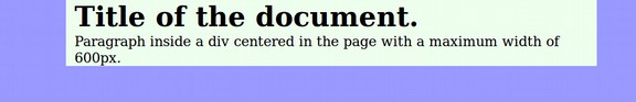
Save the HTML file and then open it in a browser:
Sadly, there will likely be a strange and ugly looking space above the divide. This ugly space at the top of your web page is caused by hidden Firefox Ghost CSS settings. Most browsers add hidden ghost settings which vary from browser to browser. If you want full control over the appearance of your web pages, then you will need to get rid of the browser ghost settings.
Three Ways to Eliminate Browser Ghost CSS Settings
Each browser has a hidden CSS Style Sheet. Each time you do not specify a CSS setting for a given property, the browser will add its own settings for you. For example, if you to not specify San Serif for your font family, then you are leaving it up to the browser to set whatever font family it wants. The Ghost Top Spacing in the above example was inserted by the browser because we did not set the body margin top and bottom to 0, and we did not setting the wrapper padding top and bottom to 0. There are three ways to override the hidden browser ghost settings. Each has some advantages and drawbacks.
Use the CSS Universal Selector ( *) to Eliminate Browser Ghost CSS
In CSS, the Asterisk character (*) stands for the Universal Selector. Using the Universal selector will apply whatever properties and values you specify with it to any other CSS selector and therefore any HTML element unless that more specific selector overrides the Universal properties and values by declaring its own values for the given properties. In your CSS file, make a new space above the body selector and add the following to your CSS:
* {margin: 0; padding:0;}
The Universal Selector does not need to be added to the HTML file because it automatically applies to all HTML elements. Just save the CSS and HTML files, and view the document again in your browser.
Not only is the ghost padding at the top of the web page gone, but the ghost padding added between the H1 tag and the P tag is also gone.
Why Use an HTML Reset instead of the Universal Selector to Eliminate Browser Ghost CSS
Some authors rightly complain that the Universal Selector cure is worse than the disease of browser ghost settings because it applies the Universal Selector settings to all selectors and all elements regardless of whether you want them or not. This not only can affect web page appearance in unexpected ways, but it also will slow down loading of your pages if you have long pages with a lot of selectors and elements.
Use of the Universal Selector has therefore fallen out of favor with an HTML reset taking its place. The benefit of the HTML reset is that it only overrides the browser settings with the selectors and elements you call out in the reset at the top of the CSS file.
In your CSS file, delete the universal selector and replace it with the following specific selectors:
html, body, h1, h2, h3, div
{margin: 0; padding: 0;}
Then save the CSS and HTML files and view the result in your browser. This should look the same. In order to increase the readablity of our remaining screen shots, we will also add the following to our wrapper:
font-family: san-serif;
We will also change the Firefox default font setting to san-serif. Then save the HTML and CSS files and view the result.
We are finally ready to add our table to create our first table based static page layout. We will create a table with one column and four rows. The first row will be for our header image, the second row will be for our Navigation Menu, the third row will be for our Main Content and the bottom row will be for our Footer.
|
Body |
W |
Header Image |
W |
Body |
|
Navigation Bar aka Main Menu |
||||
|
Main Content |
||||
|
Footer |
Outside of our Table Layout are the wrapper and the body.
How to Make a One Column Four Row Static Table Page Layout
In your HTML document, enter a new line below the paragraph closing tag. Then click on the Tables Tab. Then click on the Table Wizard icon.
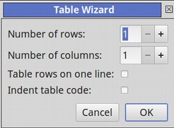
Increase the number of rows to 4. Then click OK. This will insert a four row table with a cell in each row. Recall that a table is divided into rows (with the Table Row or <tr> tag), and each row is divided into data cells with the Table Data or <td> tag. td stands for "table data," and holds the content of a data cell. A <td> tag can contain text, links, and images. A table data cell can even hold other tables. But it is best not to place lists, forms or videos in a data cell. Instead, you should place text and or images with links to web pages for displaying your forms and videos.
Inside each table data cell, type the row and cell number. Then click File Save and view the page in your browser.
We need to put a border around the table so we can tell it is a table. We also need to give each row its own background color in order to tell the rows apart. We can do this by using classes such as class=”row1”, etc. in our html file. But it is better to use more descriptive classes for our table rows by describing what each row does in case we add more rows in the future (which would upset the class numbering sequence but would not upset a class function sequence).
So we will add the following four classes to our four table cells:
class=”heading”, class=”navigation”, class=”content”, class=”footer”
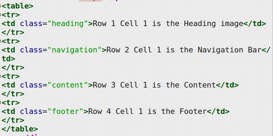
Remember that in HTML tags, the class needs to be inserted inside of the opening tag. Here is what our HTML now looks like:
To see the rows better, we will add a fixed height and background color to each of these classes. We will also increase our wrapper to 620px and add a width of 610 pixels and double border to our table.
We then need to add the following to our CSS file:
table {
width: 610px;
margin: 10px;
padding: 10px;
background-color: #ffeeff;
text-align: center;
border: double;
border-width: 4px;
border-color: black;}
td {
width: 600px;
padding: 10px;
text-align: center;
border: double;
border-width: 4px;
border-color: black;}
td.heading {height: 50px; background-color: #eeeeff;}
td.navigation {background-color: #eeffee}
td.content {height: 100px; background-color: #eeffff;}
td.footer {background-color: #ffcccc;}
Save the CSS and HTML files and view the page in your browser:
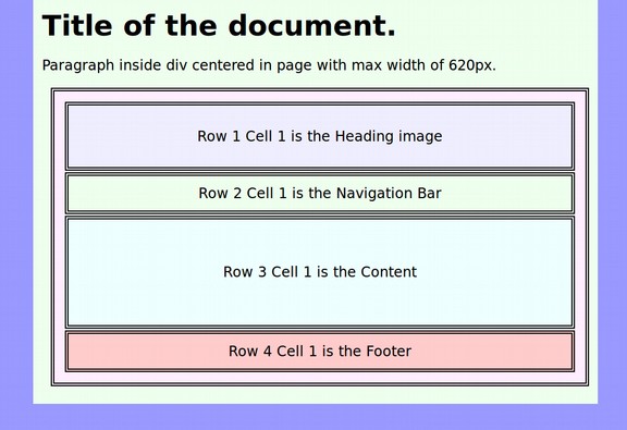
In a real page layout, the wrapper, table and data cells would all have a width of 600px (or whatever you want). We have made them different so you can see each box. Also, the heading image would be at the top of the page and the Title and first paragraph would be inside of the main content data cell.
How to Make a Two or Three Column Four Row Static Table Page Layout
The key thing to remember about static Table Page Layout is that content should only go inside of data cells. Each row and cell requires an opening and a closing tag such as the following: <tr><td>Main Content Here</td></tr>
To add another column in the same row, simple add another data cell:
<tr><td>Main Content Here</td><td>Side Menu or Feature Box Here</td></tr>
Then inside of each cell is the actual content, which may be images, text, links and or lists. Assign a descriptively named class to each new data cell. Then style the class in your CSS file include a fixed width for each cell that totals the max width for all cells in a given row.
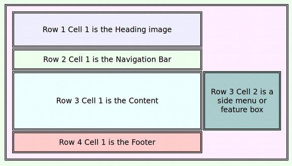
When we add a second cell in a row in a table, it is likely to upset the entire table. The solution is to place a new table in the Row 3 Data Cell. Then add the two cells into this new one row table. Adding new tables in cells is a way of resetting the width of the table. Here is the HTML for the new data cells in the new table:
<td class="content">Row 3 Cell 1 is the Main Content</td>
<td class="content2">Row 3 Cell 2 is a side menu or feature box</td>
Save the CSS and the HTML and view the file in your browser:
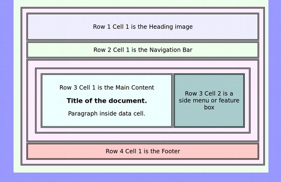
Again, in a real table page layout, the total widths would be the same and you would only see the data cells and not the wrapper or the tables. A third data cell could be added to our new table to create a three column layout.
CSS PROPERTIES FOR TABLES ROWS AND CELLS
Different properties are used depending on whether you are modifying the appearance of a Table, a Row or a Cell.
|
CSS Property |
Possible Values |
Description <table> |
|
width |
Pixels or % |
Specifies the width of a table |
|
#xxxxxx |
Specifies the background color for a table using a 6 digit hexadecimal code. |
|
|
Pixels |
Specifies the width of the borders around a table. |
|
|
pixels |
Specifies the space between the cell wall and the cell content |
|
|
pixels |
Specifies the space between cells |
|
|
Pixels or % |
Sets the margin outside of a table between the table and other elements. Generally set for 0 in the body or wrapper to eliminate “browser ghost margins.”. |
|
|
align |
left, center |
Specifies the alignment of a table – no longer supported… See below! |
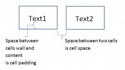
Cell padding versus cell spacing
Because all content in a static table page layout occurs with in cells, it is important to understand the difference between spacing in a cell versus spacing between cells. Here is a diagram to show the difference:
Supported Way to Center a Table… Create a Table Class
In your html, add a class to the table: <table class=”center”>
Then in your CSS, add the selector:
table.center {margin-left:auto; margin-right:auto;}
You can also use 0 auto for the margin. You can also use percent widths like this:
table.center {width:70%; margin-left:15%; margin-right:15%;}
What’s Next?
This completes our review of using tables to make fixed or static page layouts. In the next section, we will describe how to make more responsive and flexible page layouts using divides.