
While horizontal drop down menus are the most common and space efficient form of website menu, expandable mega menus are becoming increasingly popular. There are several benefits to mega menus. The biggest is that if you have a huge number of menu items, you can have just a few top level categories and then have a several sub-categories in the drop down – each with its own sub-sub-menu items. You can also add images and even feature boxes inside of the mega menu drop downs.
Most tutorials on making mega menus are very complex. They involve replacing the normal list items with divides and then placing divides inside of divides. We will instead use a copy of our existing dropdown menu we created in the last section – and then add our mega menu inside of one of the list items. To see how this is done, create a new root folder called My Dropdown to Mega Menu Website. Then copy the index.html file from My Mobile Menu Website and paste it into our new root folder. Then open this new file with Bluefish and change the title to My Dropdown to Mega Menu Website. Then open the file with your browser to make sure it displays properly.
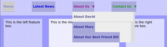
In the previous section, we created hidden drop down sub menus under the About Us and Contact Us top level menu items. Our goal in this section is to replace the About Us dropdown menu with a much larger mega menu. Let’s start with the HTML. Here is the HTML for our About Us drop down unordered list:
<ul><li><a href="#">About David</a></li>
<li><a href="#">About Mary</a></li>
<li><a href="#">About Our Best Friend Bill</a></li></ul>
We will carefully delete the second two list items. We will also delete the first list item and content leaving only the unordered tags. Here is the revised HTML: <ul></ul>
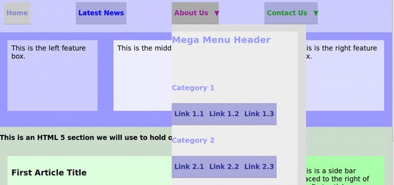
Now copy and paste this mega menu list item in between the unordered list tags.
<li><div class="dropdown-content">
<div class="header"><h2>Mega Menu Header</h2></div>
<div class="row"><div class="column1"><h3>Category 1</h3>
<a href="#">Link 1.1</a><a href="#">Link 1.2</a><a href="#">Link 1.3</a></div>
<div class="column2"><h3>Category 2</h3>
<a href="#">Link 2.1</a><a href="#">Link 2.2</a><a href="#">Link 2.3</a></div>
<div class="column3"><h3>Category 3</h3>
<a href="#">Link 3.1</a><a href="#">Link 3.2</a><a href="#">Link 3.3</a></div></div></li>
Save this file and view it in a browser – hovering your cursor over the About Us Menu item to reveal our new Mega Menu Drop Down.
The mega menu is displayed as a single vertical column. We will add some CSS to make the box much wider and display the categories in three different columns. Add the following CSS just above the head closing tag:
/*--- Mega Menu Second Level Drop Down Menu CSS Section---*/
ul.menu1 li ul li div.dropdown-content {width: 600px; background-color: #ccaaff; margin-left: -80%; margin-right: -70%;}
/* Create three equal columns that float next to each other */
.column1 { float: left; width: 30%; padding: 10px; background-color: #ccffff; height: 300px;}
.column2 { float: left; width: 30%; padding: 10px; background-color: #ccffcc; height: 300px;}
.column3 { float: left; width: 30%; padding: 10px; background-color: #ffccff; height: 300px;}
/* Style links inside the columns */
.column1 a {float: none; color: black; padding: 16px; text-decoration: none; display: block; text-align: left;}
.column2 a {float: none; color: black; padding: 16px; text-decoration: none; display: block; text-align: left;}
.column3 a {float: none; color: black; padding: 16px; text-decoration: none; display: block; text-align: left;}
/* Add a background color on hover */
.column1 a:hover {background-color: #99cccc;}
.column2 a:hover {background-color: #99cc99;}
.column3 a:hover {background-color: #cc99cc;}
/* Clear floats after the columns */
.row:after {content: ""; display: table; clear: both;}
Then save the file and view the page with your browser:
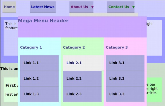
Inserting a mega menu into the list item of an existing dropdown menu is a very easy way to make a mega menu. The key to making the mega menu so wide is to add negative margins to the right and left side of the mega menu. In the above case, the left drop down box was extended by 80% and the right drop down box was extended by 70%. Had this drop down been under the Latest News parent, we might have only used minus 30% for the left margin and minus 100% for the right margin. On the other hand, had the mega menu been under the Contact Us top level menu item, we might have used minus 150% for the left margin and only minus 20% for the right margin. We will next look at adding images, text and better links to our Mega Menu
Add Images and Content to a Mega Menu
For this example, we will change our header to a linkable image called Pet Education Tips.
We will change our categories to
#1 Learn More About Cats
#2 Learn More About Dogs
#3 Learn More About Birds
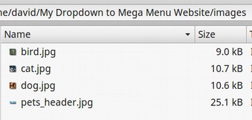
We will add the following images. Each has been resized to be 150px by 150px:
Cat

Dog

Bird

Here is our header image:

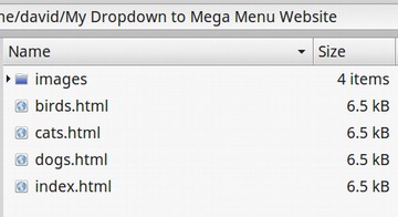
Create a folder in your root folder called images. Then save these four images into that folder. Here is what it will look like:
Also save the index.html file as cats.html, dogs.html and birds.html. Here is what the root folder now looks like:
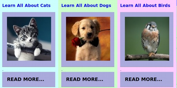
In the index.html file, in each column, replace the Category with text such as Learn All About Cats. Link 1 will be replaced by a a linkable image of the pet using <img src=”” alt=””> . Link 2 will be replaced with a READ MORE button linking to the page about that category of pets. Link 3 will be deleted.
Here is the relative link to the cat web page:
<a href=”cats.html”><img src=”images/cat.jpg” alt=”cat”></a>.
Here is the relative link for the READ MORE button:
<a href=”cats.html”> READ MORE...</a>
Resize h3 to be smaller and red with: h3 {font-size: 14px; color: #0000FF;}
Finally, replace the <h2> Mega Menu Header with this header image:
<img src=”images/pets_header_600.jpg” alt=”cat”>
Also delete from the .menu1 li selector: line-height: 40px;
Here is our finished mega menu complete with four images and three READ MORE buttons.
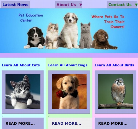
One of the main goals of every menu is to convince your viewers to click through to the interior pages on your website. Taking the time to create mega menus with colorful images and READ MORE buttons will greatly increase the percentage of readers who take the extra step of clicking through to the interior pages of your website.
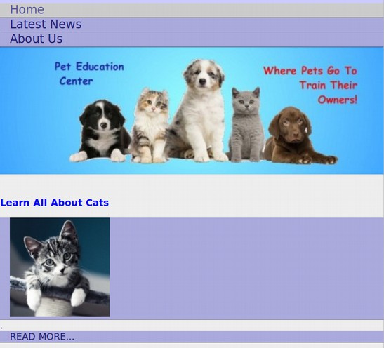
As for those folks reading web pages on narrow mobile phones, the mobile menu we created in the last section also picks up our mega menu and images with no additional changes to the CSS or HTML. Here is the top of the narrow screen version of our mega menu:
The Future of Mega Menus
While it is useful to know how to make mobile menus and mega menus with HTML and CSS, you should also know that there are much easier ways to make both of these menus. For example, with the Joomla Sparky Menu, we simply click on buttons inside of the Sparky Framework to select and style a mega menu. Then in the Joomla Menu Manager, we create normal parent menu items – also with the click of a button – and create any number of second level sub menu items and assign them to whatever parent menu item we want. These second level menu items become the categories for our mega menu. Finally, create any number of third level menu items and assign them to the second level menu items. These become the boxes of content with the READ MORE buttons.
What’s Next?
In our next section, we will learn how to make a full or partial page menu using feature boxes.
The reason to use Feature Boxes instead of hidden drop down mega menus is that you do not run the risk of the your readers failing to hover over the parent menu items and thus not even seeing your beautiful mega menu feature boxes. Placing Feature Box Menus in rows where they are visible all the time also allows for more styling options than are available inside of a mega menu dropdown. So keep reading!