
A navigation bar or menu is simply a series of links displayed horizontally across a web page. A well organized main menu is a crucial part of any web page. Think of it as being the Table of Contents for your online book. After the header image at the top of your web page, your main menu should be the first thing that your readers see. They will review the menu items before even reading the welcome article. So the structure, naming and appearance of each menu item will matter a great deal.
We will begin by creating a basic one level menu with the Bluefish Editor. Create a new root folder called My Menu Website. Then open your Bluefish Editor and create a new index.html file using the HTML 5 document type. Copy and paste the finished heading CSS and body HTML from the index.html we worked on in the last chapter. Then open your index.html page and verify that everything still looks OK.
CSS Selector Types and Combinations
Structuring and styling menus is mainly done through using a variety of CSS selector types. We therefore need to cover this topic in greater detail before creating our first menus. In an earlier chapter, we covered three different types of selectors. These were Element Selectors, Class Selectors and ID Selectors. Here are examples of all three: div, div.classname and #id_name. We later covered the Universal Selector (*).
Since then, we have minimized the use of ID selectors and used mainly Element Selectors and Class Selectors. But there are several additional types of selectors we will need to be familiar with in order to build menus. The first is a Global list of selectors. For example,
body, .wrapper, div.classname, a {color=”#0000FF”}
means make the text color for all of these selectors blue. Note that there is a comma after every selector except the last selector.
Next are Combination Selectors. This is where you not only name the class but also name the element you want the class to style. For example, div.classname is technically a combination selector because it tells the browser to use the class style only when it is associated with the element div.
You may notice that I often use a combination selector instead of merely styling the class. I do this not merely to apply the same class name to different elements and then style each combination differently, but also because when I am writing an extremely long CCS sheet, I want clues about what elements I have created classes for so I can find these classes in both my CSS and HTML.
There are also Pseudo-classes. Here is an example: a:hover {color: #FF0000}
Note the colon between the element and the state. This means when a persons cursor is hovered over a link name, the text color of the link name should change to red.
Next is the Descendant Selector. This is a way of targetting a particular element and styling it only when it occurs inside of another element. Here is a common example used in styling menus:
ul a {color=#00FF00}
Note that there is a space between the elements. This means make the link text color green but only when the link is inside of a list item. All selectors are read by the browser from right to left. So it will first look for all anchors (a) and then look for anchors inside of an unordered list and apply the style to just those anchors. In the above case, the anchor is referred to as a descendant of the unordered list.
There are also Child Selectors. Here is an example.
ul.menu1 > li {display:inline-block;}
This means when a list item is inside of an unordered list with a class of menu1 that the list item or menu item should be displayed as an inline block.
Difference between a Child Selector and a Descendant Selector
Consider the example of a child in a family versus a grand child. A grand child is a descendent of a grand parent. But not a child of the grand parent. So a Child Selector requires an immediate relationship between the two elements whereas a Descendant Selector applies to all descendant elements no matter how far down the list of elements they are from the top element. Consider this example.
<div><table><tr><td><p>
Now imagine you want to style this particular p element.
Using div p as a descendant selector means to style any p element that is a descendant of a div element. However, using div > p as a child selector means to style any p element that is a direct child of a div element. Because the p element is a child of the td element, using this child selector in your CSS would not achieve what you wanted.
Combinations of Classes
You can also have combinations of classes that will allow you to style individual menu items. For example, consider the following HTML.
<nav><ul class=”menu1”>
<li><a class=”red” href=”#”> First Menu Item</a></li>
<li><a class=”blue” href=”#”>Second Menu Item</a></li>
<li><a class=”green” href=”#”>Third Menu Item</a></li>
</ul></nav>
Here would be the CSS to style the menu items:
ul.menu1 a.red {color: #FF0000;}
ul.menu1 a.blue {color: #0000FF;}
ul.menu1 a.green {color: #00FF00;}
Perhaps the biggest challenge of styling multi-level menus is determining the type and order of the needed CSS selector. Because practice makes perfect, let’s try a couple of examples.
How to make an HTML menu with Bluefish
In the nav section, delete the sentence, “This is a navigation menu.” Then click on Tags, Lists and insert a part of unordered list tags. Then click on Tags, Lists again and insert a pair of List Item tags. Repeat to get four pairs of list item tags. Type in a name for each menu item. For links, use href=”#”. Because we may have more than one menu, add a class menu1 to the ul tag. Here is our HTML:
<nav><ul class=”menu1”>
<li><a href="#home">Home</a></li>
<li><a href="#news">Latest News</a></li>
<li><a href="#about">About Us</a></li>
<li><a href="#contact">Contact Us</a></li>
</ul> </nav>
Here is what it looks like with our web browser: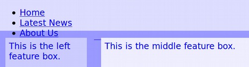
By default, unordered lists are displayed vertically with bullets. The reason they are vertical is because the list item element is a block element. We could change the list items to inline but instead, we will change them to inline block so we can give them a height and width if we want. Also links are displayed with underlines. To change the display to horizontal, with no bullets and no underlines, add the following to the nav CCS:
ul.menu1 {margin: 0; padding: 0; text-align: left; list-style-type: none; overflow: hidden;}
.menu1 > li {float: left;}
.menu1 a { display:inline-block; text-align: center; font-size:16px; font-weight: bold; text-decoration:none; color:#333399; padding: 8px;}
Notes: Overflow hidden is added to the unordered list to prevent list items from going outside of the list.
To make sure that all of the links open in new windows, add the target="_blank" attribute to all of the html anchor tags.
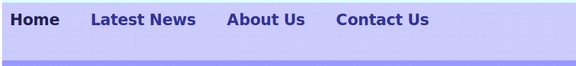
Here is the result:

Add Links to Internal Pages
Now that we have the basic idea, let’s create three additional html pages and place them in our root folder. Name the first one news.html, the second one about.html and the second one contact.html. Click File, New From Template, HTML 5 to create each new file. Then change the href=”” on all four files to index.html, news.html, about.html and contact.html.
Check the links to make sure they work. We next want to make the menu item for the current page a different color than the other two menu items. We will use the <a class=”active”> to do this.
Add this line to the CSS: a.active {color: #222255;}
Copy the CSS and the HTML from the index.html into the other two html files. Then make each of them the active class for their pages.
Add Unique Colors to Every Menu Item
As we noted above, we can add classes to each menu item in our HTML file.
<ul class=”menu1”>
<li><a class=”blue” href=”#”> Latest News</a></li>
<li><a class=”purple” href=”#”>About Us</a></li>
<li><a class=”green” href=”#”>Contact Us</a></li>
</ul>
We then also need to define the appearance of each class in our CSS:
ul.menu1 a.blue {color: #0000FF;}
ul.menu1 a.purple {color: #992299;}
ul.menu1 a.green {color: #229922;}
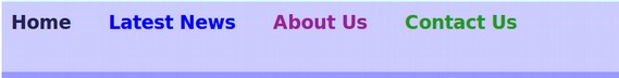
Here is what this looks like in a browser:
Add a Hover Selector
There is no need to add anything to the HTML to add a hover selector. We simply add this to the CSS:
li a:hover:not(.active) {
background-color: #dddddd; color: #555599;}
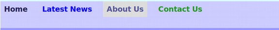
Note that the hover selector should be added after the other color selectors for it to work as the last selector in the CSS is often the one chosen by the browser. Here is how the hover looks in the browser:
How to Make a Horizontal Drop Down Two Level Menu
Now that we have a better understanding of how to style a one level menu, we will add some additional menu items nested inside of the About Us menu item. This is just basically inserting another unordered list into the About Us HTML list item. Here is the HTML:
<nav><ul class="menu1">
<li><a class="active"href="index.html">Home</a></li>
<li><a class="blue" href="/news.html">Latest News</a></li>
<li><a class="purple" href="/about.html">About Us</a>
<ul>
<li><a href="#">About David</a></li>
<li><a href="#">About Mary</a></li>
<li><a href="#">About Our Best Friend Bill</a></li>
</ul> </li>
<li><a class="green" href="/contact.html">Contact Us</a>
<ul>
<li><a href="#">Contact David</a></li>
<li><a href="#">Contact Mary</a></li>
<li><a href="#">Contact Our Best Friend Bill</a></li>
</ul></li>
<span></span></ul></nav>
Here is what this added list looks like without any CSS added:
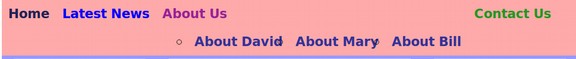
Note that the drop down menu items pushed the last top level menu item way to the right. Adding a drop down menu presents several challenges.
First, we want to hide the sub level menu items so that they appear only when the visitor hovers their cursor over the parent top level menu item. We hide the drop down by adding display: none; position: absolute; to the new unordered list CSS.
ul.menu1 li ul {position: absolute; display: none; width: inherit;}
Then we restore the appearance of the list by by adding display: block to the hover attribute for the parent list element that is above the new unordered list.
ul.menu1 li:hover ul {display: block;}
Second, we typically want to change from the top level horizontal menu to a second level vertical sub-menu. We can do this by adding to the bottom level list item display: block;. (note for a horizontal sub menu use display: inline-block).
ul.menu1 li ul li {display: block;}
Third and perhaps most difficult, we need to allow space to the right of our top level menu items for sub-menu items to be displayed. Often this problem is ignored resulting in sub-menu items on the right side of the web page going completely off the browser window! We will address this problem by reducing the width of the top level menu to 80% of the total browser window. This will leave 20% of the browser window to display the sub-menu items that are under the far right top menu item. To hide the fact that the top menu is only 80% of the screen width, we will set the nav element container to 100% and make the menu1 class the same background color as the nav element.
Here are all drop down CSS lines we will add to our CSS:
/*----- Second Level Drop Down Menu CSS Section-----*/
ul.menu1 li ul {position: absolute; display: none;}
ul.menu1 li:hover ul {display: block; width: 320px; background-color: #dddddd; margin-left: 0px; padding-left: 0px;}
ul.menu1 li ul li {display: block; width 300px;}
ul.menu1 li ul li {display: block; width: 300px;}
ul.menu1 li ul li a:hover {display: block; width: 300px;background-color: #eeeeee; text-align: left;}
Then save the file and view it in a browser, using your cursor to hover over the drop down menu item.
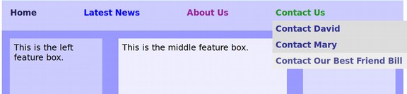
You can see that even with limiting the menu to 80% of the screen width, a long menu item on the right side can still go off the edge of the screen. We will need to be careful to avoid giving this particular sub menu long menu names. Another solution is to use a top level menu item for the far right side that does not have a drop down menu.
Add Down Arrows to Top Level Menu Items
Another problem with drop down menus is that unless a person hovers their cursor over the menu items, they will not even be aware that there are sub-menu items hidden away under the top menu items. It is therefore highly recommended to add Down Arrows to top level menu items that have hidden sub menus. Here is what you add to the CSS:
ul.menu1 li > a:not(:only-child)::after {content: "▼"; width: 0; height: 0; border-left: 15px solid transparent; border-right: 5px solid transparent; border-bottom: 15px solid transparent; float: right;}
Nothing needs to be added to the HTML. Here is what it looks like in the browser:
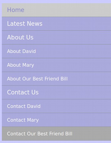
Add a Narrower Menu for Mobile Screens
The final problem with horizontal menus with or without drop downs is that they do not display well on narrow screens found on mobile phones. Thankfully, there is a relatively easy way to tell if your viewer is using a mobile phone and if so, to supply them with a simple vertical menu. We will create a menu for the narrow screens first. Then add the following for the wider screens:
@media screen and (min-width: 640px) {
Here is the complete CSS for both the mobile and wider screens:
/* common styles for all screen widths*/
body {margin: 0; padding: 0; background: #eeeeee;}
.wrapper { background-color: #dddddd; margin:auto; }
main { text-align: justify; background-color: #ccddcc; margin:auto; }
header, nav, .left, .middle, footer, .right, article, aside { vertical-align: top; display: inline-block; width: 100%; }
header { height: 80px; text-align: left; background-color: #ddffff;}
nav {background-color: #ccccff;}
.container1 {background-color: #9999ff;}
.left { margin: 2%; padding: 1%; width: 21%; height:150px; text-align:left; background-color: #ccccff; }
.middle { margin: 2% 0; padding: 1%; width: 40%; height:150px; text-align:left; background-color: #eeeeff;}
.right { margin: 2%; padding: 1%; width: 21%; height:150px; text-align: left; background-color:#ddddff; }
span {display: inline-block; position: relative; width: 100%;
height: 0px;}
footer {height: 50px; text-align: left; background-color: #ffdddd;}
p.bold {font-weight: bold; align-self: left;}
p.right {font-weight: bold; align-self: right;}
article {margin: 2%; padding: 1%; width: 66%; height:100px; text-align:left;background-color: #ddffdd;}
aside {margin: 2%; padding: 1%; width: 21%; height:100px; text-align: left; background-color: #aaffaa; }
/* menu style for narrow screens*/
.menu1 ul {list-style: none; background-color: #444444;
text-align: center; padding: 0; margin: 0;}
.menu1 li {
font-family: sans-serif;
font-size: 1.2em;
line-height: 40px;
text-align: left;}
.menu1 a {
text-decoration: none;
color: #ffffff;
display: block;
padding-left: 15px;
border-bottom: 1px solid #888888;
background-color: #aaaadd;}
.menu1 a:hover {
background-color: #aaaaaa;}
.menu1 a.active {
background-color: #cccccc;
color: #8888cc;
cursor: default;}
/* Sub Menus */
.menu1 li li {
font-size: .8em;
color: #9999ff;
background-color: #eeeeee;}
/* menu style for wider screens*/
@media screen and (min-width: 640px) {
/*----- Top Level Drop Menu CSS Section-----*/
ul.menu1 {width: 80%; margin: 0; padding: 8px 4px 0 10px; text-align: justify; list-style-type: none; overflow: hidden; background-color: #ccccff; z-index: 99;}
.menu1 li {display: inline-block;}
.menu1 a {display: inline-block; text-align: center; font-size:16px; font-weight: bold; text-decoration:none; color:#333399; padding: 6px;}
li a.active {
color: #222255;}
ul.menu1 a.blue {color: #0000FF;}
ul.menu1 a.purple {color: #992299;}
ul.menu1 a.green {color: #229922;}
li a:hover {background-color: #dddddd; color: #555599;}
ul.menu1 li > a:not(:only-child)::after {content: "▼"; width: 0; height: 0; border-left: 15px solid transparent; border-right: 5px solid transparent; border-bottom: 15px solid transparent; float: right;}
/*----- Second Level Drop Down Menu CSS Section-----*/
ul.menu1 li ul {position: absolute; display: none;}
ul.menu1 li:hover ul {display: block; width: 320px; background-color: #dddddd; margin-left: 0px; padding-left: 0px;}
ul.menu1 li ul li {display: block; width: 300px;}
ul.menu1 li ul li a:hover {display: block; width: 300px;background-color: #eeeeee; text-align: left;}}
/* be sure to add the closing double bracket at the end. */
Save the file and open it in a browser. Then bring the browser window in until the screen switches from the normal menu to the narrower mobile menu. Here is what our mobile menu looks like:
A Better Way to Make Drop Down Menus
If you think all of the above is way too complex, there is an easier option. Just use the Joomla Helix Framework. It comes with several menu options that can be styled just by clicking on buttons and be up and running in less than 5 minutes. Here is a link to our course describing this process:
https://createasecurewebsite.com/
While it can be useful to know the underlying HTML and CSS, Content Management Systems like Joomla combined with frameworks like Helix are making it very fast and easy to style amazing menus extremely quickly just by clicking on buttons.
What’s Next?
Now that we understand how to make drop down menus using HTML and CSS, in the next section, we will review how to make an expandable mega menu.